Fix iTerm2 Neovim Dim Colors/Color Space Issues
I’ve recently been spending some time configuring Neovim to look and feel the way I’d like. An issue I ran into from setting up color themes, however, was that my iTerm2 colors looked pretty off from what the color theme previews did, and even more off from the same theme running in Alacritty, which I installed to troubleshoot this stuff (I really don’t wanna use Alacritty, iTerm2 is super nice.)
My eyesight isn’t great, but I could easily tell that the colors were dimmer / washed out / lacking in gamma. These fixes aren’t too technical, just some settings things that some people might easily miss.
Juggling color spaces is apparently a very difficult thing for many applications to do. (Alacritty and iTerm2 were both off from the preview, but iTerm was just “more off”)
After scouring forums and git discussions and testing a bunch of different configs + settings, I’ve discovered 4 problems and their solutions:
1. iTerm2 Background Bleed
Playing around with Color Preferences, I found that iTerm has a phenomenon where iTerm2’s background color “bleeds through” Neovim color themes.
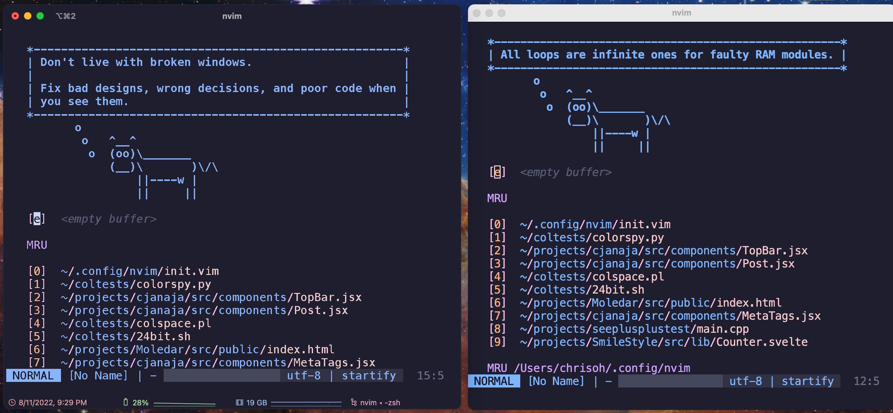
Here’s catppuccin nvim with iTerm’s Light Background preset.

Presumably this is less of an issue if you use a terminal brightness that matches your Neovim brightness (light-light or dark-dark.) Here’s the same theme with iTerm’s Dark Background preset.
Much better. But if you want extra brownie points, better colors, and a more cohesive look, it helps to have iTerm’s color preset match Neovim’s.
2. To Alias or Not To Alias?
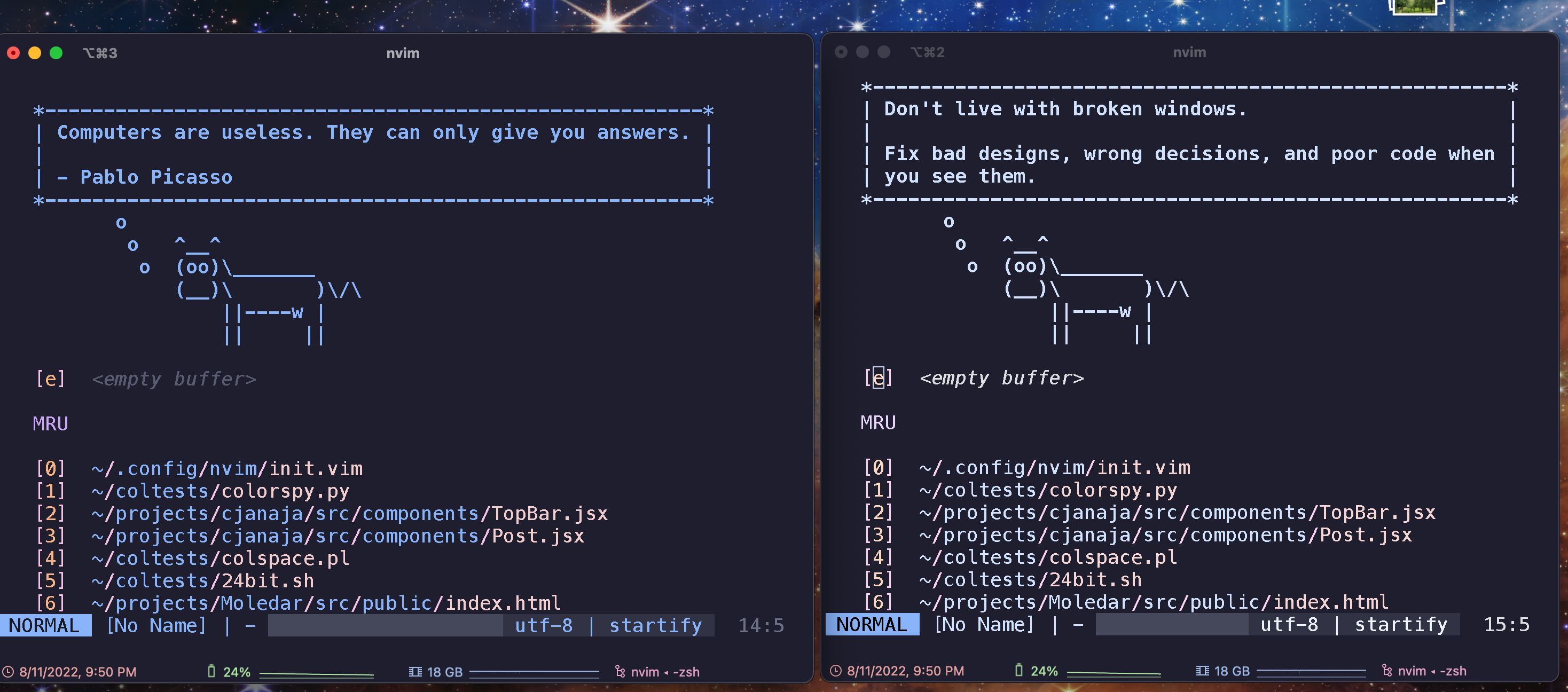
A big I wanted to solve was text readability. iTerm’s text rendering just feel too “light” to me. Here’s nvim in iTerm (left) and Alacritty (right)
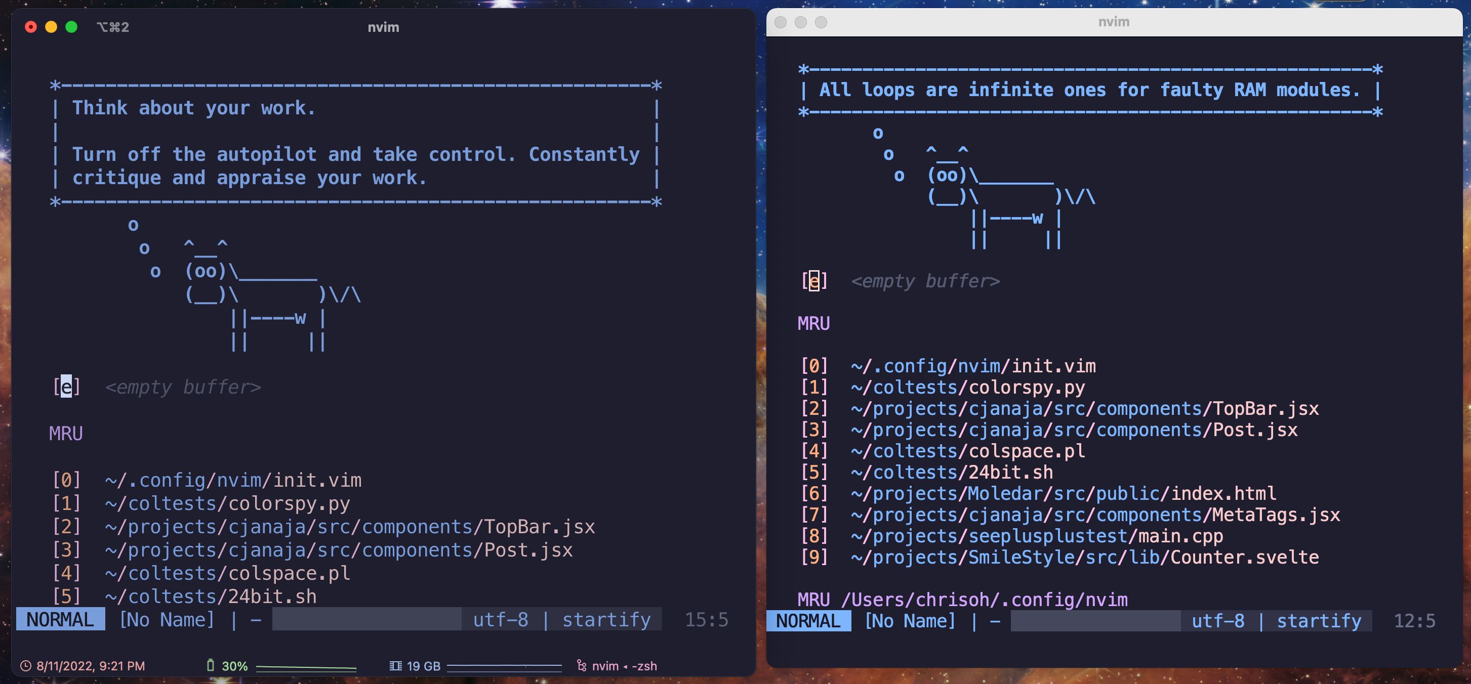
Alacritty’s text looks much bolder, no? It really contributes to a different color perception (and higher readability.)
A nice modification was to disable anti-aliased font. (Profiles > your profile > Text | Font)
It’s not too major of a change, you may not even notice it on your end (maybe because of image quality) but the difference was pretty stark to my WEAK eyes. Try it out, see if you like it.
3. Cursor Boost is just Background Dim
The greatest change among all of them was to set Cursor Boost to 0. (Profiles > your profile > Colors | Cursor Colors)
I didn’t realize it for the longest time, I have no idea when I even turned it on, but I found that it “boosts” the cursor by dimming everything else. Yikes. Setting it to 0 made colors much more vibrant, which was my primary peeve.
This is pretty much the parity I needed. They’re not exactly the same (which I’ll naively attribute to color space weirdness) but they’re close enough for me, a satisfactory solution I spent an entire day goofing around to find. Oh the joys of terminal perfectionism.
4. Minimum Contrast Contrasts with Perfection
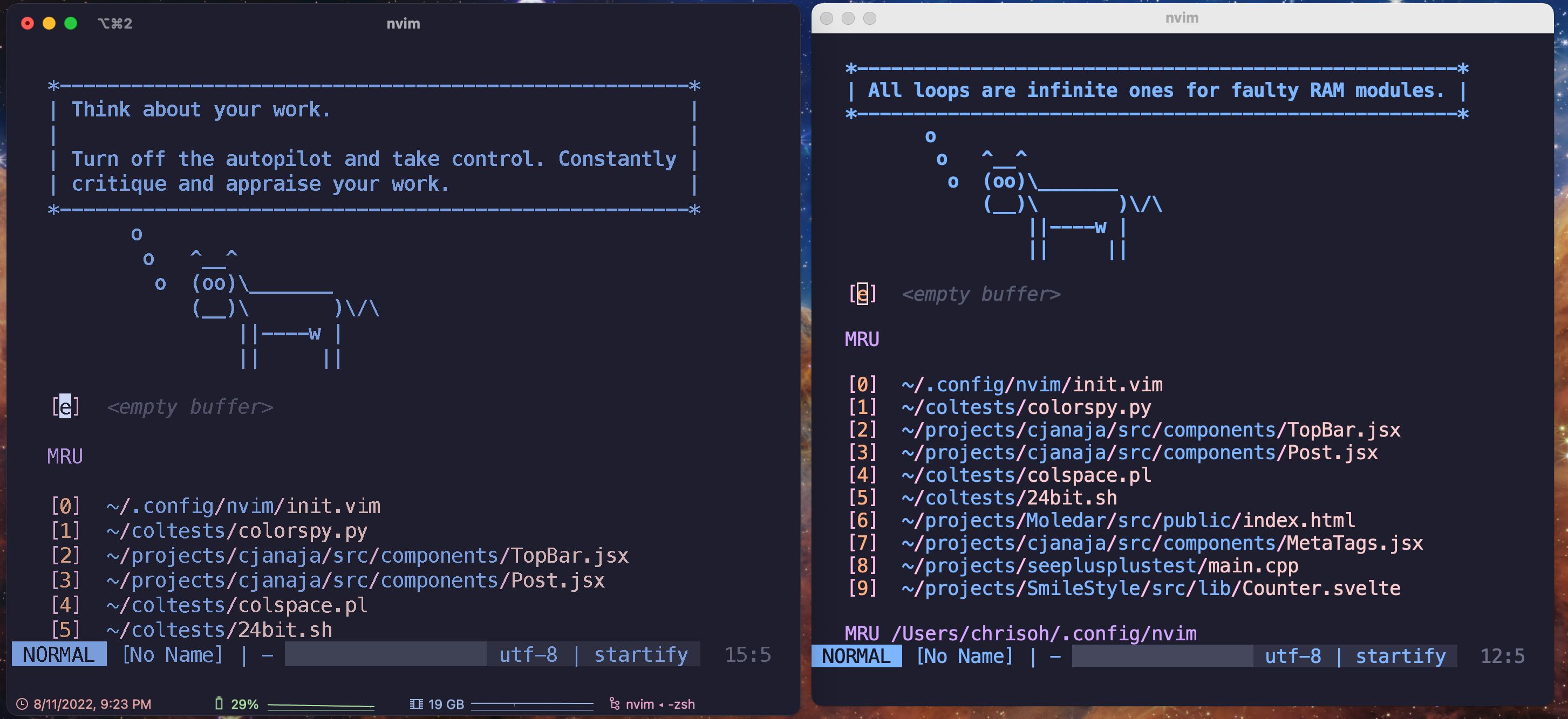
I didn’t have this setting on, but found it while testing things out. Basically, if you have Minimum Contrast (Profiles > your profile > Colors | Basic Colors) set high enough, it’ll desaturate your colors. Here’s the same theme with Minimum Contrast set to 0 and 75, respectively.
I’m sensitive to this kinda stuff, so it’s really nice to have colors figured out. Color space foolery was actually one of the reasons I decided to use VSCode less. I woke up one day and my VSCode theme was a lot dimmer+desaturated for some reason, tried finding fixes and went the nuclear route. Thanks for nothing, sRGB.