Site Design Two
Long overdue, I’ve recently redesigned my personal site. Originally I only wanted to change around the homepage so I could add an Experience section, but wound up changing pretty much everything about the design in the process.
Making everything on the page rounded? So pleasant, but so unserious. I’m trying to take myself more seriously here.
A pastel-only palette? Visually relaxing, but sort of drab (and hard to make work in dark mode).
Having a flavor essay on the homepage? Kinda made me cringe reading it, though that’s mostly a fault of my writing.
A sidebar? I actually didn’t want to drop this, but I realized it would look kinda awkward the more projects I added. Also, it made the index need its own layout since the code behind it was different from the rest of my old site. Not great to maintain, overall.
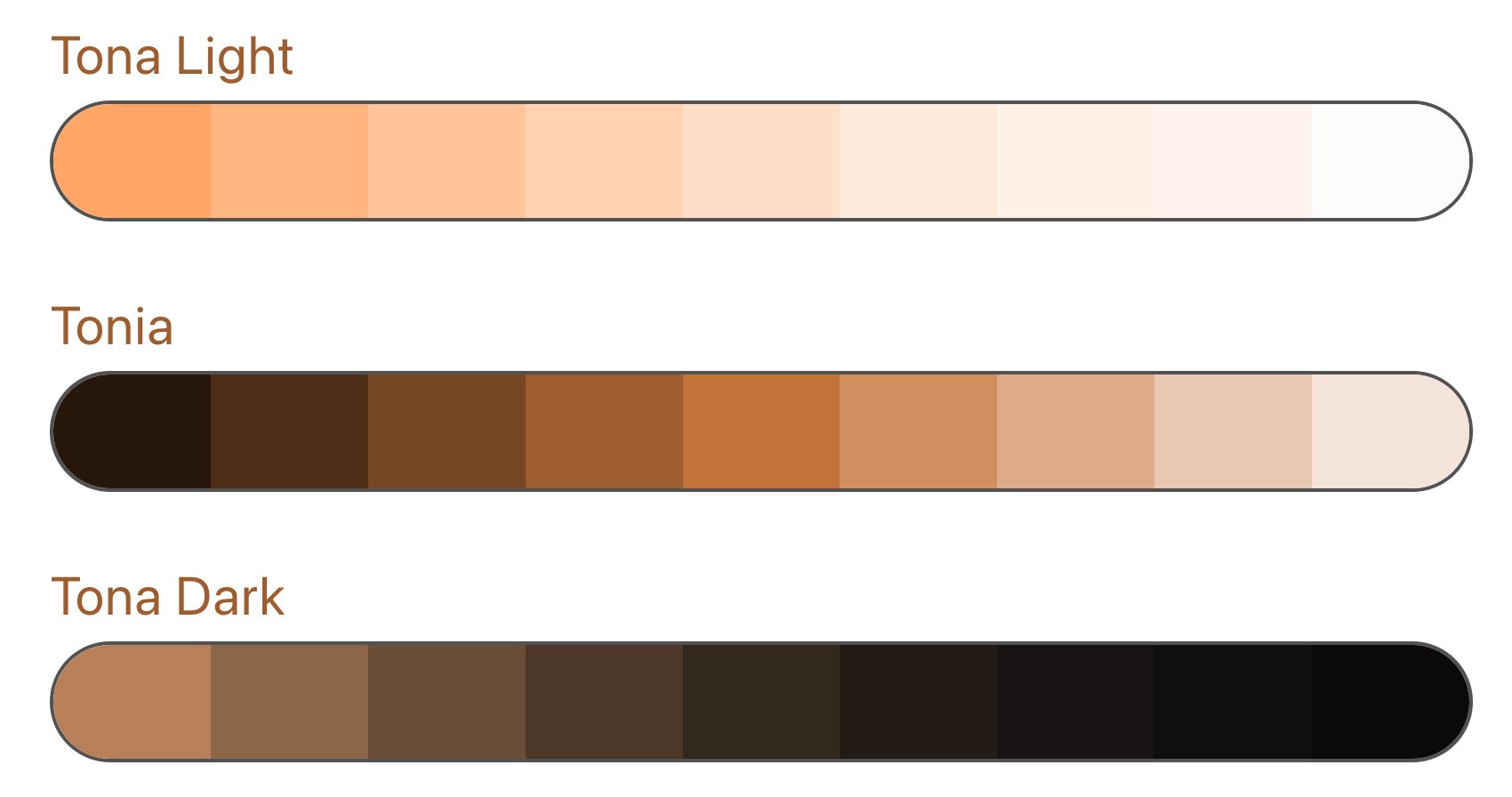
Color System 4? (I lost track)
For starters, I’ve leaned both closer to and away from the color theming thing I had going on before. Having everything on the page including the background color match was nice, but..
- It was kinda iffy in places in terms of accessibility
- It made posts slightly annoying to read in some cases, like when the background was light green, for example
- Restricted what I could do with colors in most cases. Like, I could never have a white/black component on the page because it “had to match” everything else. Not fun!
Back when I was making the initial design I just wanted it to stand out more than anything. I think that colors are best suited for accents, now. I’m no professional designer, but it feels nicer this way.
Making the design + code 10 times simpler using TailwindCSS
I used to have a really complex setup that used styled-components and custom React props and CSS variables and Sass that made things really, really annoying to work with. I’m not gonna bore you with the details, but I did rant about it.
Anyway, now it’s all CSS variables and some magic I weaved with Tailwind. It’s super nice having an expansive system I can just pick colors from until it works, instead of having to make absolutely everything custom and manage its implementation. Working on my site is a joy again.
Astronomical: Gatsby to Astro
I also switched from Gatsby to Astro. Very long time coming, in my eyes. Gatsby’s a real nice framework, but when you get into the thick of it, also real bloated and a mess to configure. I never needed to use GraphQL for anything more than setting up the Markdown pages, which Astro handles for me. My gatsby-config file was 200+ lines long. I used server side rendering. Things got messy.
I asked around for advice and Jerome recommended switching to Astro like Ben did so I could keep my JSX setup, and I’m glad he did. The code changes I needed to make were very minimal, and overall I’m happy with its paradigms.
There was an issue I ran into regarding image optimization, so I wrote a package for that. I’m super pleased with where everything’s at right now, and making pages is much more straightforward than it was with Gatsby.