Let There Be Dark (End Light Mode Derision, Please)
Embarrassingly, I’ve been hacking away at implementing a dark mode for about three weeks (of course, with college and stuff also taking up time within that three weeks.) Nonetheless, it’s here, and as I promised, it’s great. Still in need of tweaks here and there, but it’s great. Trust me.
Why was this not a thing in the first place?
I know, right? It seems like an obvious “initial thing” that a blog’s gotta have, since people are so fond of their darkness.
The exclusion of dark mode was originally a feature, not an oversight. I’ll tell you this: I am a light mode evangelist. Most of the time, I have everything I possibly can (except what I write code in, for now) in light mode.
I appreciate the existence of dark mode for the times I need it, but I’m one of the seemingly rare sort that isn’t comfortable with light text on a dark background in most cases.
Yes, we exist.
Dark Mode Reactionaries
I don’t know how or when, but there’s been an overall shift in how people view each other, and it feels like it’s trending towards being plain mean: People who’re caught using anything in light mode are ridiculed in lots of online (and sometimes offline) places.
Send screenshots of Discord or Reddit or Twitter or iMessage or X software in light mode to a dark mode denizen, and a non-insignificant amount of time, you will face derision. “Ewww, you use light mode?” is the socially encouraged “LOOK AT THIS GUY! HE’S WEIRD! HE USES SOFTWARE DIFFERENTLY THAN ME” of the net and I hate it.
Keeping everything light made my site feel more personal, like my little act of rebellion against the norm.

Immature and short-sighted, yes, I admit.
No longer shall that be the case. Realistically, why would I WANT people to not feel comfy reading what I write? It was self-sabotage. I like it when people like what I make, my really-real friends asked why I didn’t have a dark mode, and I wanted to see how nice I could fit it into the color thing I’ve got going on.
I’m compassionate for the robots (and maybe people) that read what I write. So, I put bunches of effort into making it as usable and pretty as I could.
This was no simple feat. I quite literally structured my blog and its components around light mode, with no consideration for theme switching at all in the beginning. My bad. So I had to re-architect a lot of things, and that’s where the past three weeks went. 1
Nonetheless, things are dark now. And I finally rest, watching the sun set on a grateful internet.
You may be thinking: “Why all this blathering over what largely seems like an inside joke?”
Matters of accessibility shouldn’t BE “haha you’re weird” inside jokes, methinks. That, and the “joke” just gets painfully old after a while, you know?
And don’t pretend that there aren’t people that act with genuine snobbishness and get personally offended when somebody has the gall to show them the color white every once in a while.
Yes, they exist.
Very Subjective Case Studies Of An Endangered Species Taken Out Of Context
Lonely in a CS lecture? Open Discord in light mode! It’s like a free “talk to me” beacon, and you already know how the conversation’s starting!
For starters, I find Twitter’s hover state for tweets in dark mode to be far less discernible compared to the light mode’s. Just my dual pennies.
In both of these instances, the top tweet is being hovered.
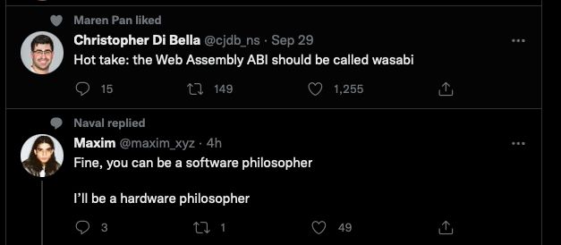
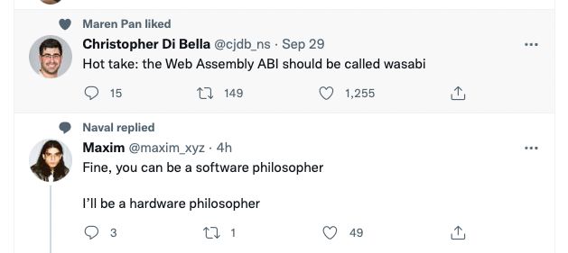
A Small Sample of Light Mode Derision across a small variety of servers and platforms
These bits were collected within the span of 15 minutes via text search. Imagine what one sees through daily internet browsing, and you can kinda see where the feeling of being ostracized comes from.
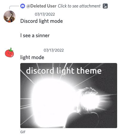
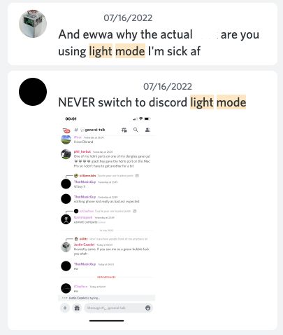

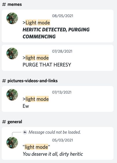
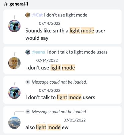
This guy’s asking the questions that need to be asked: Why do people hate discord light mode users? Or is it just me? r/discordapp
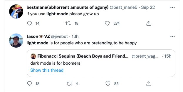

Really, I wish I was dedicated enough to this to scour the whole net for every appearance of dark mode reactionaries. The point I’m getting at is that theme preference is the lowest hanging, most dead horsefruit you could possibly pick/beat.
Footnotes
-
I had a color system where I would pass named HSL(Hue, Saturation, Lightness) values as arrays down to components through props and apply them using styled-components. That’s the best oversimplification I can pull out without sounding like an absolute buffoon with how I originally wrote everything.
I thought I would be doing a lot more experimental and unique stuff with the freedom of it, but I didn’t find a use case where the prior structure was particularly useful or pleasant to use.
It was actually a bother in lots of cases, but I found fun (and still kinda do sometimes) in working with overly-complex drivel. That’s just me.
Anyway, I tossed out the entire previous color system and moved to sanity-land by doing everything with CSS variables. They’re so convenient, love `em!
There are still some changes I need to make real quick to get things perfect, one is optimizing how blog post styles are applied (it’s kinda weird). But, it’s shipped! The reworks paid off; it’s much easier to work with the site, and I got to do a lot of spring code cleaning while changing the system around. ↩