Birdie
“Graphic design is my passion.” Very funny internet statement for people bad at graphic design. I like to think I have “some” sense despite not taking any formal art classes, and try to exercise it plenty.
See that little glyph in the top left/middle? Doesn’t it look like a bird’s head, if you squint and pretend it looks like the side of a bird’s head? I like it a lot. I think it looks clean. It’s one of my Personal Little Things.
Presently, I think having a personal logo is somewhat cringy. Who the heck do I think I am, assigning random shapes to an identity? But to be plain is to be boring, and the future is iconic.
I didn’t wanna do the strangely ubiquitous “pixel art of my face” things; they don’t work for everything. And I’d have no idea where to get one, I mean, imagine asking a friend “Hey, draw me smiling at this specific angle, but with pixels, it’ll be really cool, trust.” I digress.
My name wouldn’t work, too, in most cases. It’s a lengthy one. So, a logo it is. One that doesn’t take itself too seriously, lest I come off as snobbish.
I drafted this thing up in Figma over the course of a lunch period during school:
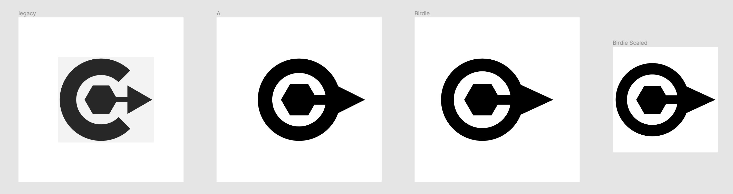
If you stick your nose in design circles, you get major points for doing abstract stuff with a purpose, so if you look at it in pieces it’s a C inside of an O, oh wow those are my initials! How avant-garde! Look at the center, it’s a hexagon, which for some societal reason represents functionality! Magnifique! And there’s an arrow pointing forward, how modern! It’s all neat to me. I don’t design often, but I think it looks nice enough.
The original concept was being hashed out alongside my site’s design, which I was hashing out during college app szn. I was tangentially inspired by MIT’s website, with the I in MIT changing colors with each page you’re on (which is really cool to me, since the page matches the theme.)
Originally, the hex thing in the middle was gonna change colors, but I found that it looked really weird, since the hex was small to the point of insignificance. It was a weird bright blip on the page, and I just couldn’t see myself making everything work the way MIT did. And I tried, lots.
Messed around with it a bit and ended up with what’s on the right half. I actually tried to avoid the bird’s head thing for a long while, but eventually thought it looked funny enough to be perfect. The initial design is so weird and alien looking, while the final one looks kinda like a cute clueless bird if you look at it right, but abstract if you ignore that part.
I’m not even a bird person.